Blog
Stay up to date with the latest mobile payment trends and insights
The secret of increasing in-app purchases
One popular method to make money with mobile apps is to introduce and increase mobile in-app purchases (IAP). As opposed to charging users upfront to download your app, in-app purchases tend to be more profitable app monetization tactic as they allow you to charge for digital items that can be bought within the app. A SuperData Research estimates in-app purchases for games to grow from $21.4 billion in 2014 to $23.4 billion by the end of 2015.
Another report from eMarketer suggests that people are more likely to spend money on in-app purchases in free apps, than to purchase an app that costs money to download. Apps that included in-app payments made up 98% of revenues for Google Play store, and 92% of revenues in Apple’s App Store. Best ideas are based on the freemium model. Offering the user a free version of the app, show him how great it is, and then offer exclusive features and content for money. Distimo‘s report showed that 90% of mobile gaming revenue came from in-app purchases in free apps.
But how do you do it? What does it take for people to buy items in your app using in-app purchases? We narrowed it down to features that you should include in your app in order to get more in-app purchases. Supposing you already worked on your app store optimization, used any of the free methods to promote your app, you are all set and ready to work on improving your profits.
Make sure people know your app
If you want people to spend money on your app, you need to give them a reason to do it. Give them enough free features so they have time to fall in love with your app, to master it and to want more.
One of the apps we love best that are using this strategy are Endomondo fitness app and the popular Evernote productivity app.
Show samples of what they receive with in-app purchases
People want to know what they are spending their money on, so give them some samples. For example, if you buy this shield, it will protect you from obstacles. (Ex. Temple run)
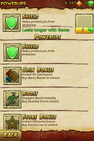
Screenshot from the game Temple Run
Use familiar visual language
Depending on the app you have, you can define your audience and research apps similar to yours. Copy the same visual language to make it easier for people to understand that they can make in-app purchases. For example, many designers use the cart icon in games, while others prefer to use the symbol “+” that leads to a store.
Use the limitations
Games that are limited by time or moves will make people buy. For example: you spend all your moves in one game, and you need to wait 15 minutes to refresh your moves. Many people who are already “hooked” won’t wait for these 15 minutes to pass. They will pay just to keep on playing. Just make sure that the price is affordable.
Pay to save me
People can often get interrupted when they are in the middle of a game. Offering them an option to save the progress with in-app purchase is a great idea! This feature allows the user to keep playing the game later, without losing the game progress. This can be a great option since people are more likely to pay when in a hurry – they will make a snap decision.
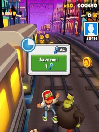
Screenshot from the game Subway surfers
Learn from casinos
If you have ever been to a casino, you may have noticed there aren’t any clocks around, so people can lose perception of time. It is similar with mobile games. People often lose track of time, and if you want to help with that, just make sure that the status bar is not visible to the player.
Who likes ads?
The most obvious and common feature that everyone is using is rather simple, but effective. Provide a ‘remove ads’ option for your users. Most of them will love this version more.
Offer the best payment method
Although many people are still using their credit cards for in-app purchases, many mobile users don’t have a credit card, or it is too risky for them to use it. That’s why it’s necessary to include different payment methods. Paying with their mobile phone bill is the easiest and most secure way. It can be used to pay for mobile apps, social media games, online games, app stores, and more. Users skip all the registration process and don’t even notice they have paid for something.
Make users feel good
Show them that you care by giving them free things at the beginning. By doing this, they will feel better and more eager to keep using your app. Later on, this feeling will lead to increased in-app purchases.
Ask for purchases
If you don’t ask people to buy something within your app, they may never notice the in-app purchase option. Don’t use pushy tactics, or send them constant notifications, but make sure that your in-app purchases are clearly visible to your users, understandable and easy to use.
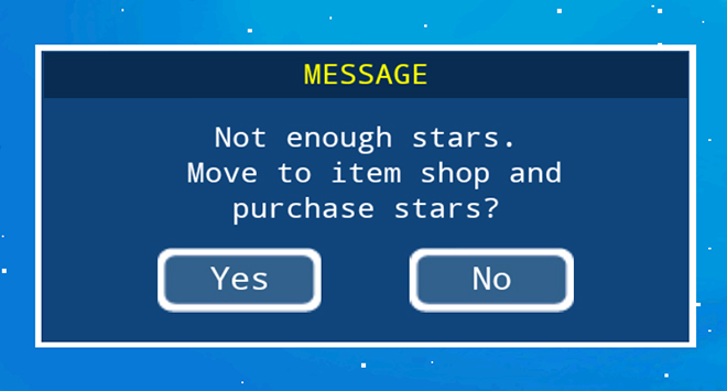
Screenshot from Super Action Hero game
Limited offer
Limited offers are widely used in everyday retail environments, for one simple reason: they work. Offering something for limited time only will make the users buy immediately, because they feel like they will miss the chance. These offerings should be really provoking and of higher value. For example, you can offer something for half the price, and make the offer last only 72 hours.
Offer the right thing at the right time
Imagine you are in the middle of a battle, and suddenly your blood level is decreasing. Are you willing to purchase that health potion? Of course you are. Offer the exact thing that the user needs at the right time. It will be hard for them to refuse the offer.
Seasonal, holiday time
Use the season to promote something new. Santa Claus costume on that worrior? Totally cute. Think about Thanksgiving, Spring time, Easter, New Year, etc. to include in-app purchases promotions. But don’t forget to target the right audience, because Christmas-themed goods may work in Europe and USA, but not in India. You can include some Diwali-themed goods for them. People are used to spending money around holidays, don’t forget that. Also, think about a specific time when your audience is more present, maybe for the weekends?
Use the psychology of color
What color is your in-app purchase button? How big is it? Test different colors to see what will work best for you. Here are some associations that come with colors:
- Red creates urgency, use it when you have limited offers
- Green is a pleasing color and is the easiest color for us to process
- Orange is great for calls to action as it signifies energy
- Yellow shows confidence and grabs people’s attention
Make recommendations
People like suggestions and help when buying stuff. Suggesting them to buy something that will improve their work, or something they will need before facing new levels, will make them happy.
Follow these “tricks” but don’t forget that people will only come back to your app if it was enjoyable experience. Make them feel welcome because creating a community of happy users is the secret for turning casual users into whales*.
*Whales are people who spend money on games, some developers classify them as players who spend $100 or more a month.
